Self-published authors are often not taken seriously, and I believe there is one main reason this is true.
It’s not for the quality of the writing.
Not for the creativity of the ideas.
Not even for not having a traditional publisher.
It’s all about the design.
When your book doesn’t look professional, it won’t be taken seriously by professionals.
I was fortunate enough to marry an illustrator turned graphic designer. He can’t remodel a bathroom, but baby, can he design a modern logo! Let me just say that marrying your illustrator/designer is much cheaper than having to pay one. Take this as my official marital advice, all you aspiring authors.
I want to give several examples of my own designs regarding The Shoephabet that were once not professional and now are. As you read this, I want you to think as a consumer. Which designs draw your eye? (You don’t have to know why. Just go with your gut.) Which would you pay for? Would you pay for it just because you were friends or no matter what?
THE LAYOUT
When we first started The Shoephabet, it was all me, not we. So I used Blurb’s free software to drag James’ illustrations on their green background (the files I could find couldn’t go any bigger than this…and only came with the green background), typed letters at the top of the page, and then wrote out three different styles of text to match. (I emailed the first three letters this way to several friends and asked for their
Fortunately for us (and all you readers!), Blurb also works with InDesign (and in fact, has a nice template there). When James saw what I had done with his illustrations, he died a little. To revive him, I promised that I would let him see if he could make any improvements. (Just try to improve my masterpiece, I scoffed.)
Ahem. I’ll let you decide for yourself. Which two-page spread would you rather look at–mine or his?
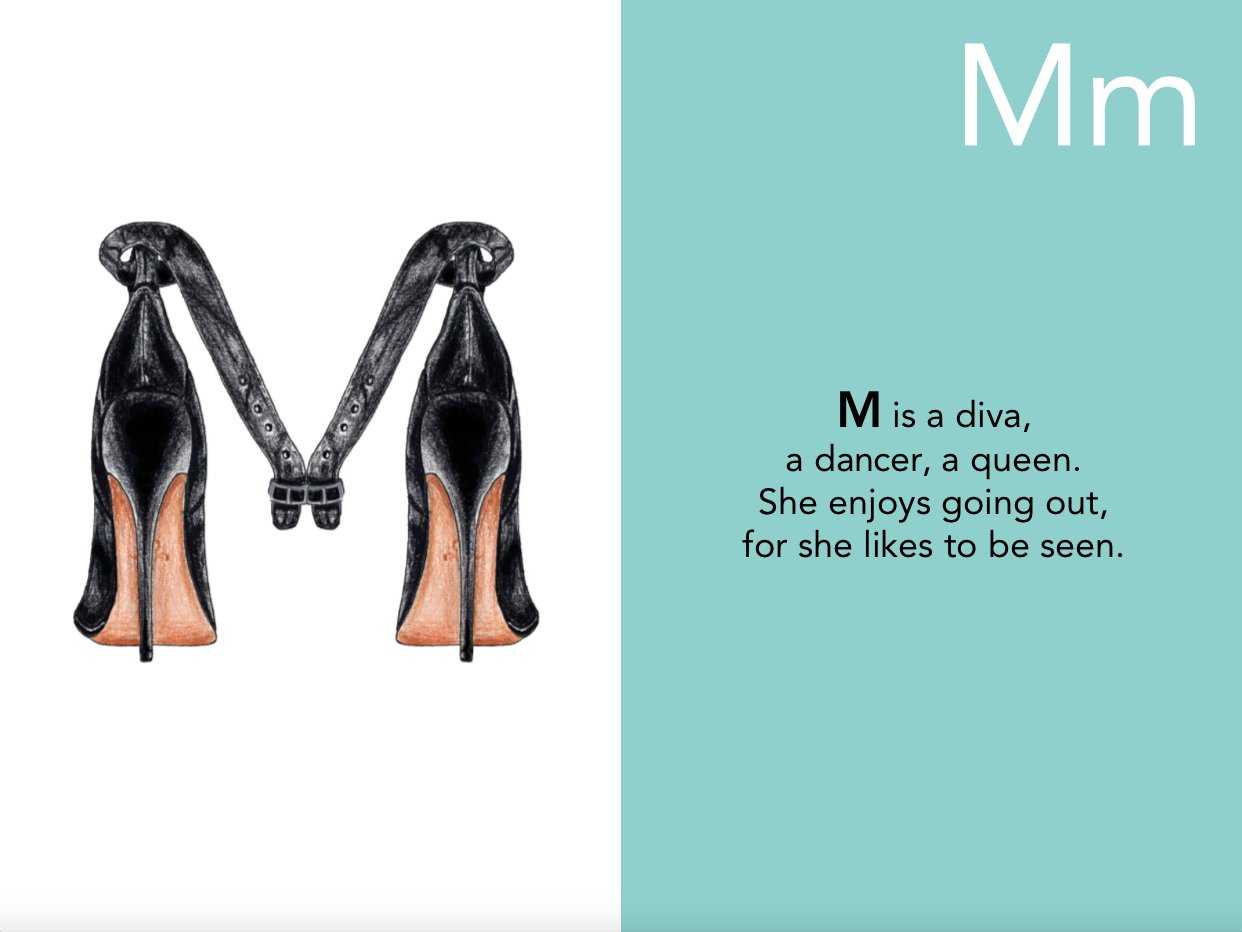
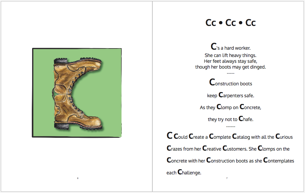
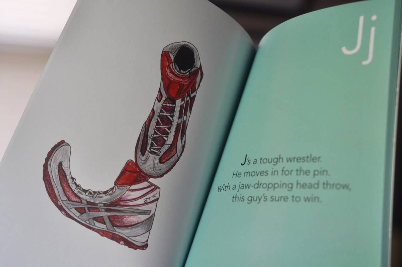
The illustrations are so detailed and so textured that we needed them to have plenty of space to breathe. They were the masterpiece. The words are only there to give you a little head bounce while you take in all the colored-pencil-goodness. He chose to place color on the text side to give the text a little boost and to contrast it with the clean feel of the illustration side. That color, by the way, was the color of the year for 2010…and it’s not out of style yet! A simple font keeps all the focus on those glorious shoes. (I may be biased, but at least 500+ of you agree with me–those illustrations ROCK!)
A side marketing tip (which will get its own larger post) is to take great photos of your work. The above design is beautiful, but in the image below, you can get the feel of the book. And it’s not just an iPhone image, so it feels even more professional.
THE COVER
Okay, we’ve walked through the inside of the book. Now, what about the outside?
You may remember that James drew these illustrations in college. When he was still learning what works and what doesn’t in the graphic design world. I thought it’d be cool to get started on adding rhymes to his shoes (although I didn’t continue work on it until 9 years later), so he offered to give me a taste of authorship by putting together a cover for this imaginary-at-the-time book. Here it is:
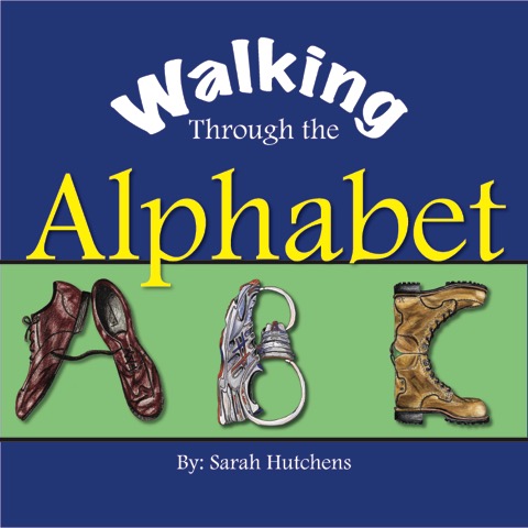
And here is the final cover design ten years later: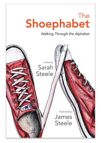
This one’s a no-brainer. One is dark; one is light. One has a bulky font; one has a simple font. Old-fashioned, modern. Serif, non-serif. Drop shadows, none. I could keep going!
Design matters.
A FACEBOOK EVENT
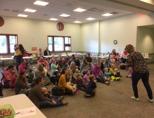
At this point, I am very aware that my graphic designer knows more than I do about design. We wrote another book, and he owned the design start to finish. But I have what he refers to as a “marketing personality.” I’m not sure if he says it lovingly or not. But what I do know is that it means once an idea comes into my head, it doesn’t go out until it’s completed, and I will do whatever is in my power (plus!) to make that happen. (As a mom of three, soon-to-be four, I have had to let go of much-but-not-all of this.) So I had this idea to start a Facebook event page for our big book launch coming up. (This is a shameless plug. If you’re in the Warsaw, Indiana, area, you do not want to miss this! <—I mean, you could win $100, so even if you don’t love the book…….)
I took the cover of the book and zoomed way in so that just the title was showing (since it’s a vertical book, I couldn’t get the whole thing nice and big in the horizontal space). Set my date and time and boom! Event page created.
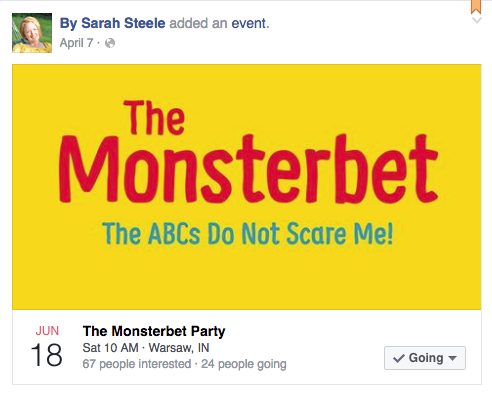
And then it popped up in James’ newsfeed. And he wondered if I’d mind terribly if he did some fiddling to create a one-of-a-kind cover image for the party. Well, I thought mine served the purpose nicely, since after all, it’s a book launch party and should have the cover of the book being launched. But. You know that I’d grown since our first book and knew his ideas were always gold. So I said there was no harm in “having a go at it.”
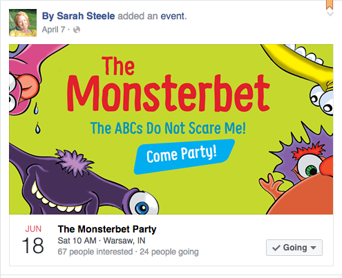
Which event looks more professional? Which is cleaner? Which says the message more loudly and clearer? Which is friendlier?
DESIGN MATTERS!
(P.S. We need at least 100 people there, so help us by telling your friends!)
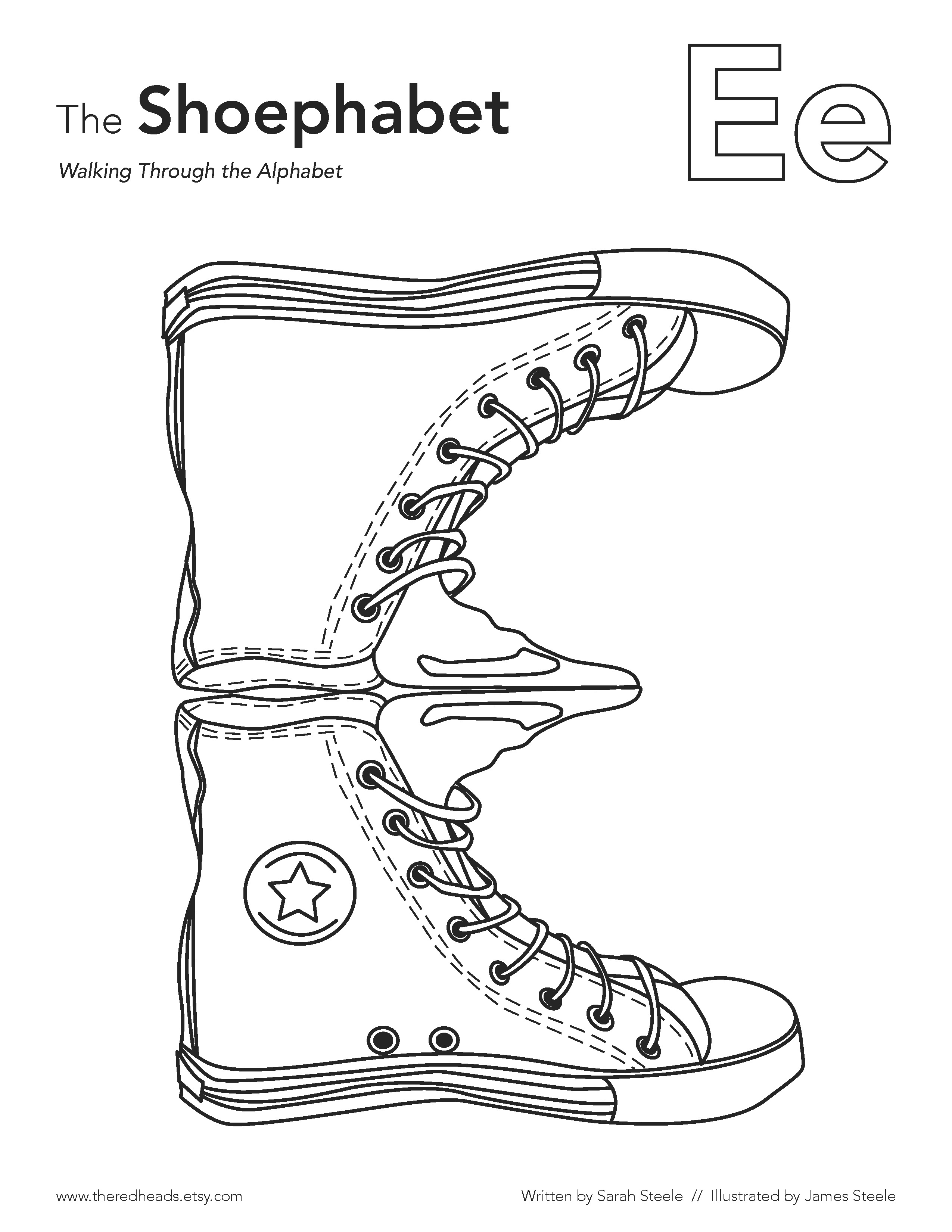
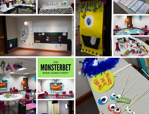
COLORING PAGES
Even down to our coloring pages, James outlined, created, designed, and laid out. He’s kept our font choices consistent throughout, colors, spacing, and style.
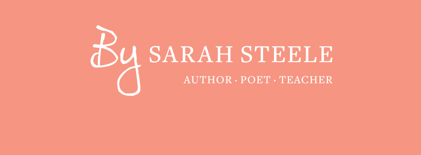
MY BRAND
He gave me a name and a logo…and this amazing website. My fonts carry through on this site, our Facebook page, my business cards, our Etsy shop, and more.
THE CONCLUSION
Good design goes a long way. It speaks to your level of professionalism. How people will approach you. How serious you are about being an author. There are plenty of sites out there that can help you with this, some for free, some for a fee. (James would cringe at my reference to free work; he respects himself far too much to be free unless for a good cause.) But do please have a professional eye look at your work. Respect yourself, respect your writing enough to place it with kindness and good design on the page. If you do, others will.
Leave A Comment